
8 Top Tips for Printing Food Photos

Recipe from PAIRED: Champagne & Sparking Wine by Fran Flynn & David Stevens-Castro. High quality hardback print production.
Regardless of whether it’s a poster, a menu, or an entire cook book — at some stage you’re going to want to print your food images — but printing doesn’t always go to plan. Once you delve into the Pandora's box of colour management you'll never see the world in the same light again! To achieve the best result you need to know a bit about how printing works and how colour is rendered both onscreen and in print...
1) Appreciate that comparing your screen image to a printed image is an unfair comparison
Screens and printers use different palettes. Screens are 'lit' and printing is based upon absorbed ink on a flat surface.
To understand colour printing you first need to understand how your screen displays colour. In simple terms, screens usually display colour by transmitting and mixing light (or phosphors) in tiny dots/pixels of three core colours: red, green and blue (RGB). There is usually a touch of black in the mix also. These colour are transmitted at varying intensities and mixed to produce a 'full colour' display. Cameras also produce images based on an RGB palette (so far so good!).
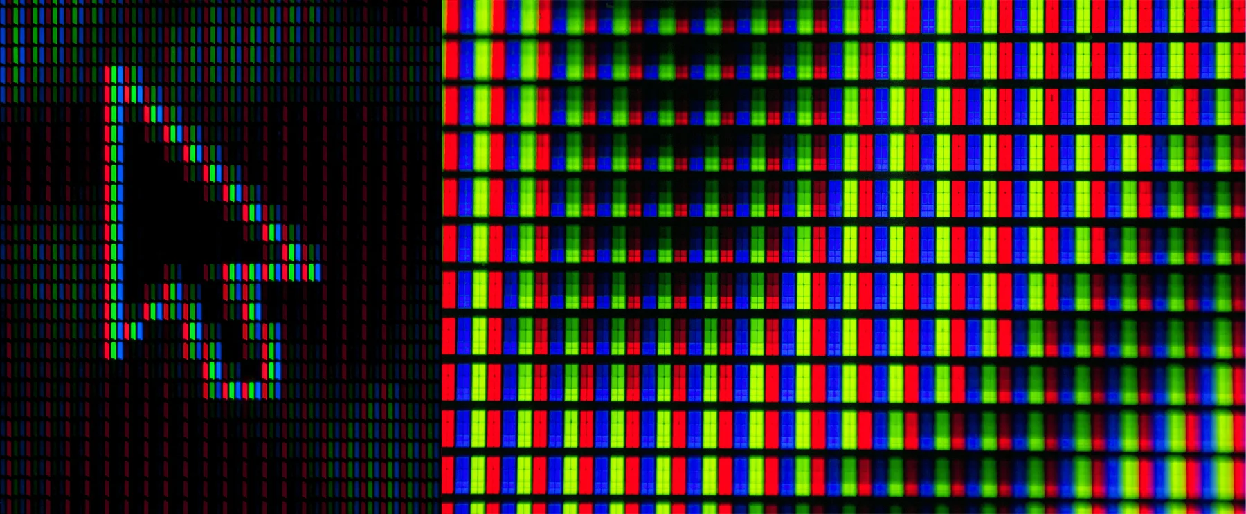
A screen display is created by mixing phosphors of tiny dots/pixels using three core colours: Red, Green and Blue (RGB)
Every screen manufacturer has a different approach to achieving the best colour rendition. Each screen will also utilise different levels of hardware and software technology which will cause significant variance.
If you display the same image on a $500 screen, side-by-side with a $5000 screen, you can be certain that the more expensive screen will have a higher level of clarity, tonal range and colour accuracy.
Different companies also use different shades of red, green and blue which can significantly impact the visual result of a screen display. This is very evident when you look at a PC screen display beside an Apple screen display. Apple uses a unique colour palette.
So in reality, if you positioned 100 different devices side by side (e.g. computer screens, laptops, tablets, mobile phones, TVs etc) you would be challenged to find two that looked identical. Next time you're in a shop that sells TVs look closely at the way colour and detail is rendered on side-by-side TVs and you'll see what I mean.
If it is inevitable that all screens look different, how can you make your screen image look identical to a printed image? The short answer is you can't. There are a variety of things that you can do to get a similar result but we haven't even started to discuss the additional variables that affect colour in printing!

The same image will look different on every screen © Photo Fran Flynn. Styling Sarah DeNardi
2) Edit your images on a calibrated screen
(Note: some of what follows might read like gobbledy-gook for those not well-versed with all things 'colour-palette'. Keep reading for the translation!)
The intention with calibration is to adjust a screen display to match a defined industry-wide protocol. Most computers offer an in-built base-level calibration feature that can be relatively successful, depending on the quality of your screen. You can also buy devices that offer sophisticated calibration. You attach the device to your screen and it will adjust it to the optimum level. Bear in mind that even if you calibrate your screen - the second you adjust anything, including the brightness - it's no longer calibrated, so it needs to be done regularly.
Even if you have the best calibration device on the planet, it can't make a poor quality monitor display beyond its optimal performance.
So let's pretend that you've got your beautiful image edited to perfection on your expertly calibrated monitor - are there other considerations? Absolutely. Now we can delve into printing!
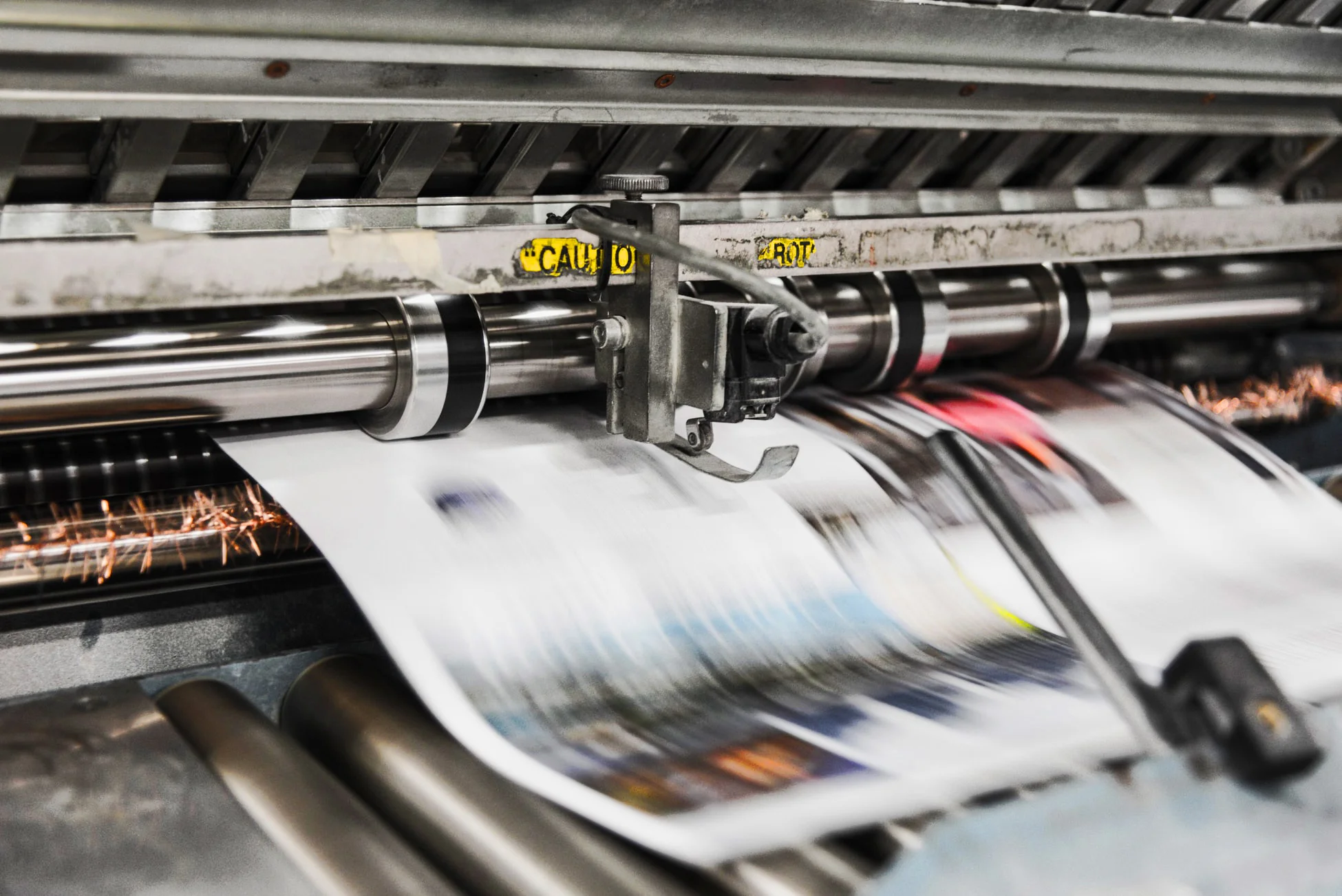
Lithographic Printing Press
2) Educate yourself about the printing process you choose so that you are clear about the potential results. There are two key print production methods in common use today for printing on paper (and additional methodologies for printing on other substrates) - i) conventional lithographic printing, and ii) digital printing.
Lithographic printing The print operator will: divide your artwork into colour plates; attach the plates to a printing press; ink each plate and then; press the plate onto paper, to create an impression. We discussed earlier how a screen uses RGB (red, green & blue) to generate 'full' colour. Lithographic printing also uses a mix of colours to create a full range, however, it uses a different palette format called CMYK. That is Cyan (which is a bright shade of blue), Magenta (bright pink), Yellow and K = Black (it's K rather than B because it's known as the 'key' ink). So there are four plates made for each print. Each colour is inked onto the printing plates in varying density. The density depends upon the intensity of that colour in your image. Then each plate is printed sequentially on top of the previous one, to create the colour mix. For example, if your photo is of sunflowers, then the yellow plate is going to be heavily inked, whereas the cyan plate won't get much of a look-in.
If you are printing on a CMYK printer, ideally create a CMYK version of your image to supply to the printers so you have the opportunity to see how well your RGB images convert to CMYK in advance (a google search and photoshop (or similar) will help you with this).
Digital printing Small quantity printing (ie. less than 250 units) is usually produced on digital printers. You can consider a commercial digital printer to be a sophisticated version of a colour printer that you might buy to use at home. The quality of the printing depends greatly on the quality of the equipment. Different machines can produce vastly different results and are based on different technologies, e.g. laser printing, thermal printing, Giclee (inkjet) printing, C Type photo printing (modern-day darkroom printing). Most of these printers use a CMYK palette also. The inks types used are variable also with many using powder-based inks, as opposed to liquid based, as in lithography. Powder inks tend to offer stronger pigment than lithography which means the colours can be brighter, and therefore closer to a screen rendition.
The key differences between the two types of printing are;
The initial setup cost for a print. Setup for lithography is a lot more complex and time-consuming and therefore much more expensive than digital, where the machine is usually 'ready-to-go'.
The unit cost once setup is completed. The unit cost of printing using lithography is much cheaper once the setup is completed, which is why it's best for large print runs. The unit cost for digital is pretty much constant so when you run larger quantities the cost gets exponentially higher. For high-end digital printing, the cost per unit can be very high.
The quality/colour accuracy in lithography is generally much higher than standard level digital. High-end digital is of excellent quality but has a price tag to match and often is useful for only one print at a time, e.g. art prints.
You usually have broader choices for paper style, paper size and finishes in lithography.
Lithography is usually produced by a skilled print operator with a lot of training and experience, whereas base level digital printing is often produced by a retail assistant who has had a quick training session with the print-company rep. (note: gross generalisation!)
High-end digital is a professional service with limited availability.
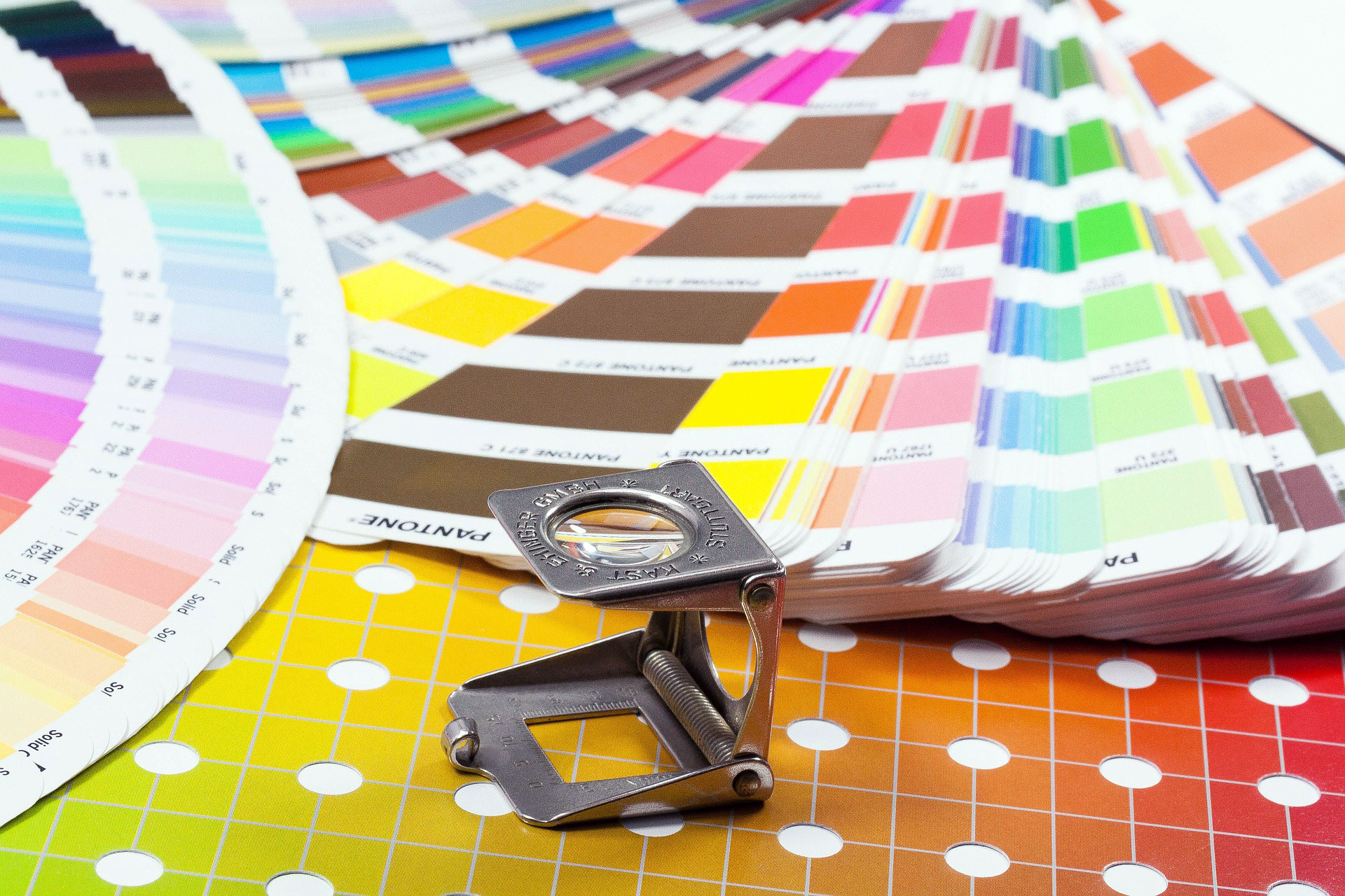
Colour management is a very skilled process
3) Your paper choice will have a significant impact on the appearance of the colour.
For example, if you choose a very smooth, gloss, bright white paper, you will likely get a relatively 'accurate' colour rendition. However, if you choose a recycled, matt finish stock, with a touch of a colour tone in the paper, your image is going to look significantly flatter (lower contrast) and the colours will be dulled.
Print processes specifically made for printing high-end art photo prints, e.g. C-Type and high-end Giclee will offer special photographic paper made by time-honoured companies like Fuji and Kodak - maximising the camera to print result.
Consider that when ink is printed onto paper, there is no 'light' behind the colours like on a screen, so the colour is less luminescent. Additionally, when the ink dries into the paper, the paper absorbs some of the brightness of the colour. Here is an example of how some bright colours might appear on a screen versus how they might appear printed.

RGB versus CMYK colour rendition © Photo Fran Flynn
Now that your mind is starting to open to how easily colour is affected, let's add some other elements into the mix that can have an impact. These include; the temperature of the environment, the temperature of the machine, the density of the application of the ink, the manufacturing process of the ink, the skill of the print operator and one more very significant element - dot gain.
Dot gain - When a printing plate is made, it's created with a surface of thousands of microscopic dots. Each dot 'grabs' the ink when applied and forms an impression on the paper. When the plate makes contact with the paper, the fibres of the paper can cause the ink to 'bleed' and spread, so the dot never ends up as perfect circle - more like a squashed hundred-legged spider. Again your paper choice will have a big impact on how significant the dot gain will be, with more fibrous paper absorbing more ink. The result is that the print will look darker than intended. Almost all paper will cause a certain measure of dot gain, but matt and recycled stocks absorb significantly more ink. Heavy-handed application of ink will add to the problem.
Digital ink tends to sit on top of the paper rather than becoming absorbed, however lower-grade digital printing can suffer from its own kind of dot gain which is due to the limitations of the printing equipment. Often darker areas are missing shades of tonality and look darker than they should. Less skilled operators rarely calibrate their equipment and this can produce very disappointing results. If the printer isn't well-maintained and cleaned regularly it will also affect the colour.
Download a FREE chapter of my ebook 'The Ultimate Guide to Natural Light for Food Photography' by adding your details here:

4) The skill level of the person producing your prints is key
A good print operator is capable of adjusting the printing machine to compensate for a lot of the variables that cause problems with good colour rendition. Genuine printing experts spend years honing their craft and have amazing expertise in perfecting colour. A print operator at a high street walk-in general print store is unlikely to be one of these print geniuses (but you can be surprised).
Tell the print operator that colour is important to you. The majority of people don't notice or care, so the operator often doesn't either. If you tell your printer that you do care, they will often take much more care with your job. When you find a printing genius, keep working with them. Stalk them if they move to a new company!

Well trained print operators are highly skilled in colour management
5) Expect to pay more for quality
If colour is really important to you there are many ways to find the best print company. You ask about the experience level of the operator, exactly what printing equipment they are using, the maintenance rotation of the printing equipment, and whether the machine is calibrated or not. Ask straight-up if they offer a premium service and if you can expect a top-quality result. You can also ask to see sample prints that have been produced by the printing equipment and to compare them to their screen equivalent. You'll find out pretty quickly if they are interested enough to put the time and effort into your job. This level of attention and service doesn't come cheap though. We're not talking 50c per print here!

High volume printing press in action
6) Get a proof-print first that you approve before printing multiple, or very large format prints
For multi-print jobs if you receive a proof that you are happy with it means that print operator has a guide to work with and you have grounds for complaint if the variance is too large. You can sometimes get a digital print that you 'approve' prior to the lithographic print run, so that the print operator has a guide for what you find acceptable. Remember though if your proof-print is digital and on one type of paper, and your print run is lithographic and/or on another type of paper, there will be some unavoidable variance between them.
7) Most importantly - be prepared to accept some variance
Even in the best of circumstances, you will experience a variance level of between 5-10%, depending on the printing process and substrate you're printing on. As long as the print gives the same 'impression' as the image on-screen, be happy! Don't look at them side-by-side because the printed result can never look as 'brilliant' as the screen rendition, because it's not 'lit' and the colours are being rendered by a different palette (RGB versus CMYK). In the case of printed items, two print runs will never look identical. Be accepting of that and be satisfied if the result looks good when viewed independently, rather than beside the previous run, or printed on a different substrate, or on a screen.
8) Consider editing your image so that it’s brighter than you'd like it to appear in print
Editing your images to appear brighter than you aspire to for the end result will likely compensate for some of the dot-gain. This is an inexact approach because you can't know what level of dot gain will occur (unless you're working with a printer that can supply their dot gain stats, which is rare). If you're printing on matt or recycled stock you can assume that the dot gain will be significant. Working with a lighter image can help to compensate for that. If you decide to edit your images ideally get a proof print first so that your printer has a guide to your preferred result, otherwise it is a bit of a lottery.
What has your experience of printing been like? Any horror stories, or fantastic results? Do you have any questions related to printing your shots? It would be fantastic to receive your comments below…
Want to know THE best lighting angle for food photography that works every time? Download my free cheat sheet by entering your details below:

You might also like:


Hi I'm Fran, a professional photographer and designer based on the Gold Coast in Australia. I’m a lifelong creative, passionate about producing drool-worthy images that provoke emotion and make you hungry! My obsession is teaching others how to achieve the satisfaction of realising their creative vision. I also love to produce high quality visual books (especially cook books) for my clients.